Paper Prototype
For our first assignment in HCDE 451: UX Prototyping Techniques, we explored simple paper prototypes as a quick way to evaluate UI design elements in a digital medium. We were tasked with creating a simple paper prototype for a software platform that utilizes a wearable watch app in conjunction with a simple mobile app.
Leading up to this assignment, I had a difficult time keeping track of my household chores while at the same time transitioning to the new quarter's class times, extracurricular meetings, and assignment deadlines. This led me to the idea of prototyping a simple to-do list. I have yet to find a "to-do list" app that I'm satisfied with on my current smartwatch, so I decided to create my own! My main goal was to use the smartwatch for easy access/reminders of each day's "to-do list." For me, it's helpful to glance at my watch and see a quick snapshot of my day's responsibilities. So I started designing what I thought would be a helpful app for myself: To-Do.
My initial sketch (right) is for personal use: it allows me to see an overview of the app's requirements and layout.

My initial sketch of To-Do for personal reference. Includes requirements and general layout.

After deciding some of the basic functions of To-Do and understanding my desired layout, I begain creating more detailed screens. To ensure that the project scope is appropriate for a week-long assignment, my professor suggested that we focus on a specific interaction in our prototype. I chose to focus on user interactions with the actual to-do list: populating the list, editing items, and deleting items. By limiting the scope of the assignment, I allow myself to focus on creating a prototype for just a few screens: Home, Edit Item, and Add Item
To the left is a photo of two mobile phone screen designs: Home and Edit Item. I used these very low-fidelity sketches to run a quick evaluation with a closeby friend to gain any preliminary feedback on the design/functionality. Since there's not much context given in two sketches, I walked my friend through the app's purpose and his role: create a new item for your to-do list. This preliminary evaluation concluded with my friend suggesting that I "add a feature to sync with my Google Calendar so it automatically tells me what I need to do each day." Using this feedback, I added a new screen: Calendars.
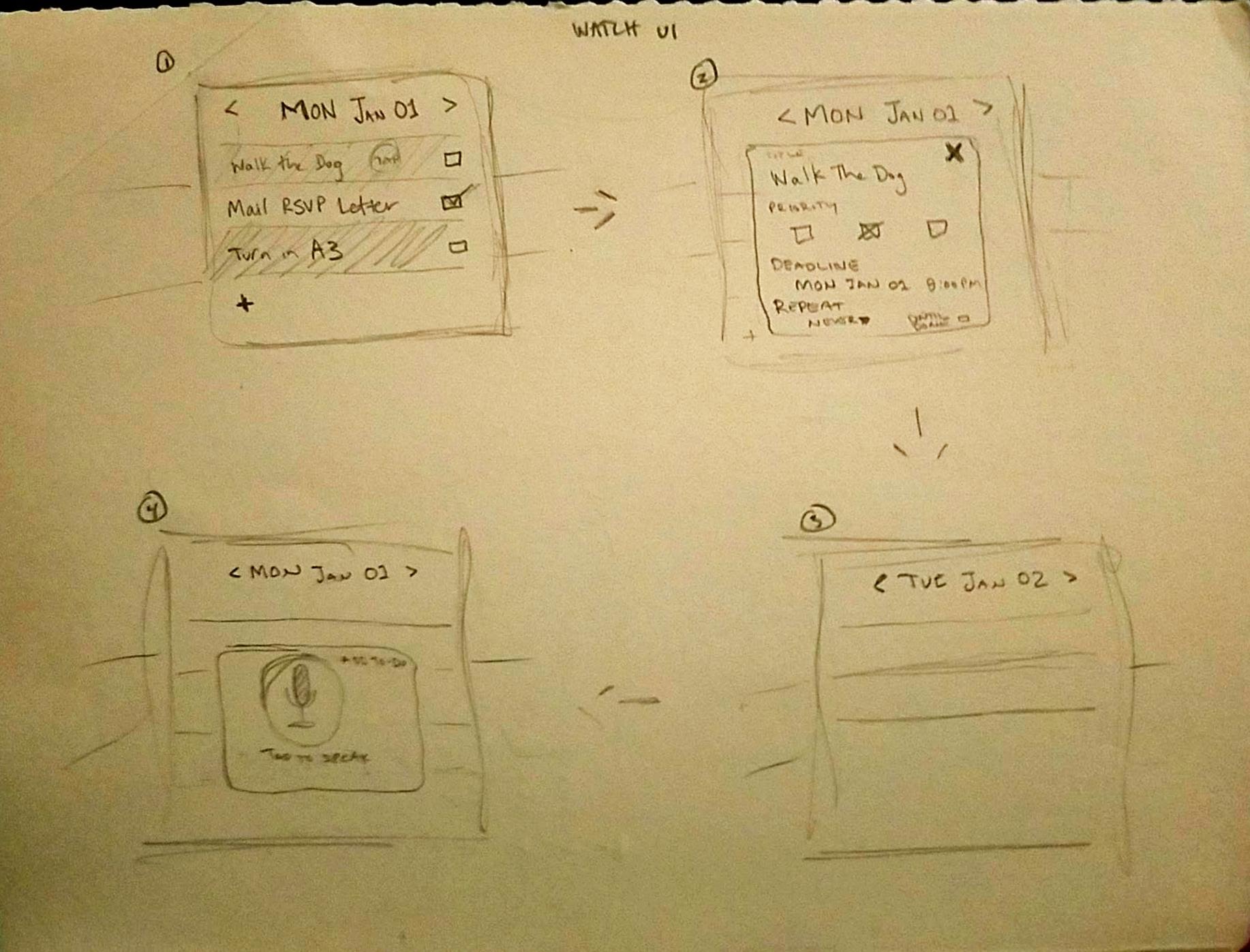
Next, I can focus on the smartwatch app design. Having experience with my Huawei Watch, I knew that typing is a hassle. I want to focus on the viewing and interacting with existing "to-do" items, but I also want a way to quickly create a new item while on-the-go (without pulling out your phone). I decided to try out a voice feature: to add an item, quickly press a button on the watch and say something along the lines of, "walk the dog by 8pm tonight." The important aspect of this feature is that it allows quick access so that users can add an item before they forget. While on the go, it's less important to get the item's specific details, like the "repeat" and "priority" settings, because these details can later be edited in the mobile app.
The smartwatch designs (to the right) keep a consistent style with the mobile app designs. By keeping all of the complex interactions (like editing an item) to the mobile interface, the smartwatch interface remains simple.

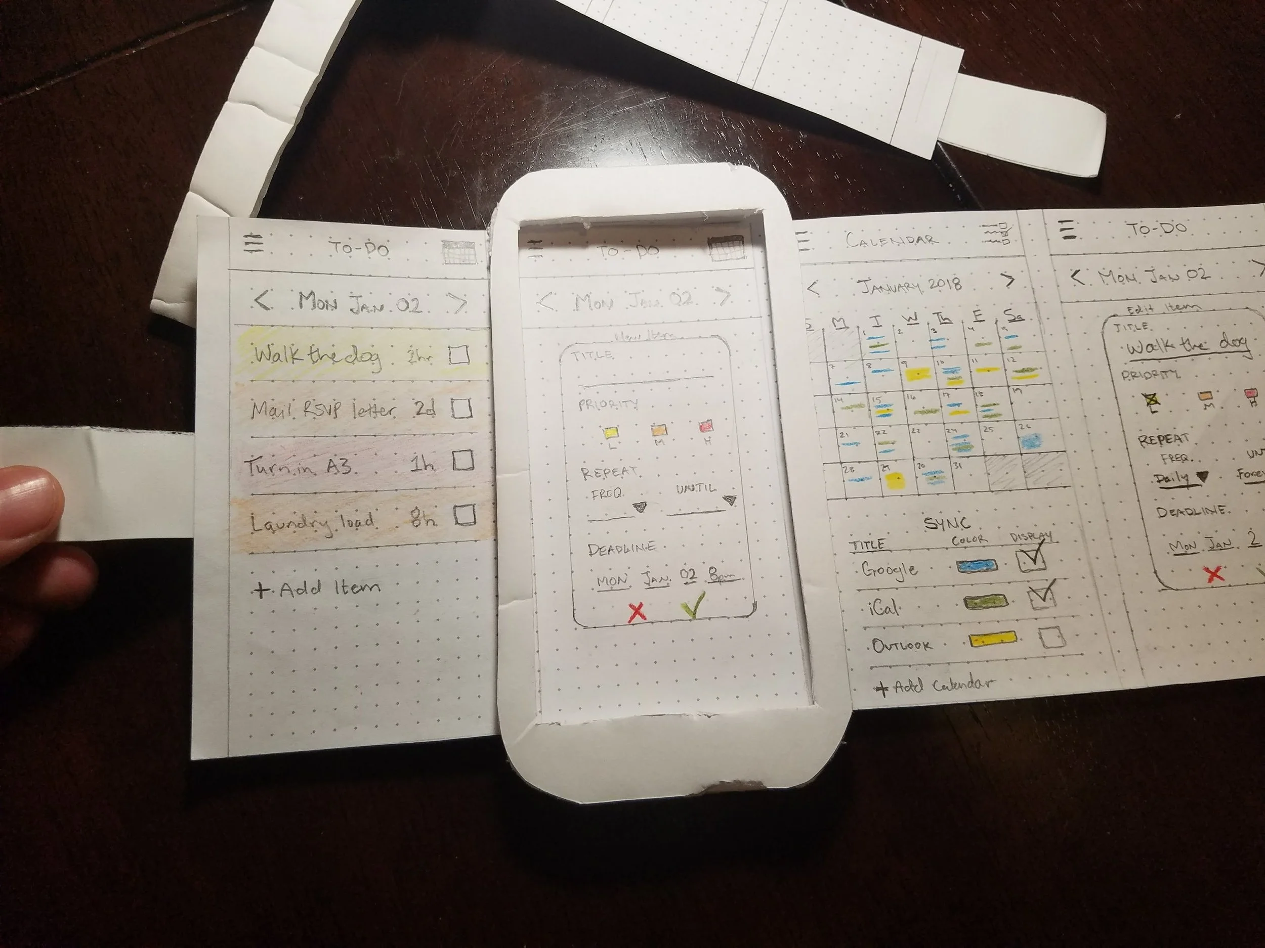

Now comes the most fun part: making To-Do come to life! I had a ton of fun with this portion of the assignment, and I got a bit carried away building the actual prototype frame. I cut styrofoam to resemble a Galaxy S that I could thread my prototype sketches through. The pull tabs on either end make it easier to change between app screens. The watch was a bit more difficult because of the slightly more precise cutting required. I also went a little overboard on the watch and made it wearable. I cut foam watch straps and glued a magnet onto either strap's end so they can clasp together and fit on a wrist. I then started to add magnets at varying intervals so that it could fit different sizes of wrists... But I soon realized how unnecessary (although fun) this process was, and forced myself to focus on the real task: designing the app screens!
I deliberately used pencil; users are more likely to provide critical feedback if the prototype looks a bit less refined. The higher quality the prototype is, the more time you spent building it, so the less likely your friend is to point out a giant flaw and potentially hurt your feelings. By using pencil and a few colors, I can convey the same message while also eliciting more honest feedback from my testing participants. I created the phone screens first, and I decided that it would've been smart to include some "blank" screens to allow for future edits/additions! I made sure to include blank screens for the watch. In the same way that using pencil encourages better feedback from users, hopefully my blank screens will encourage more iteration from designers!
Time to see what a potential user thinks by putting my prototype into action.
The video above is of my friend Hank interacting with the To-Do prototype. Paper prototypes require interaction from the designer as well; ideally I would be able to change screens for Hank when needed, but my hands were occupied with the video camera. This definitely affected the overall quality of the evaluation, but didn't hinder it completely. The quick evaluation gave me insight on both the digital and physical elements of the prototype:
The Digital:
- "Tap to speak" watch screen needs to more clearly instruct the user;
- Support swipe gestures for both watch and mobile;
- Color-coding item priority and calendar source is effective;
- Calendar overview is effective;
- Allow more interaction with items on to-do list (swipe to delete, hold to re-order, etc);
- Include a calendar overview in the watch interface.
The Physical:
- Heavier phone/watch frame will assist in testing;
- Pull tabs are effective;
- Watch straps get in the way;
- Increase contrast with darker pencil markings where necessary;
- The more autonomously the user can administer their own testing, the better;
- Include interaction screens for hamburger menu.